
Luxury EV Design
UX DESIGN | UX RESEARCH
This 5 screen in-vehicle design was created for a luxury EV. The main goal was to have a technology based interface with no hard controls. By keeping the design simple and straightforward by mimicking some of the features you would find in a classic ICE car, the learning curve is reduced while also encouraging users to explore all of its features.
Problem Statement:
New electric vehicle drivers do not want to relearn simple tasks due to the lack of physical buttons. They also want access to new features that are easy to locate and use.
RESEARCH
The first step was to figure out what features were required. Since the prompt wanted all of the controls to be in the screens, I needed to do some research on how other brands place similar features and how they are interacted within the screens. I wanted to be cautious when placing everyday actions that users would normally find within the hard controls, because I felt these would likely cause the most frustration if poorly placed.
After looking at many different car screens, particularly electric cars, they all seemed to keep the design simple and limit possible distraction. I decided to focus on newer brands with more modern screen designs such as Tesla, Lucid, and Ora. These examples have many of the hard controls within their screens which was useful when it came to coming up with my goals.
I also decided to look at an Apple CarPlay screen, as well as a Jeep screen, due to their sizes. Since I chose to work on the option with the most screen space, I wanted to see how other brands utilized their space.

After looking at these examples, I was able to come up with some goals based off of the feedback these designs were getting.
Limited learning curve
Keep basic controls in similar places despite there being no hard controls.
Keep it simple
Create a simple, organized interface across the 5 screens without flooding space with too much information.
Useful design
Make sure all screen space has a purpose and limit the amount of useless graphics.
USER FLOW

LO-FI WIREFRAMING
My initial wireframes were created flat and in black-and-white to make sure I don’t get distracted by design details early in the process. I find this helpful in circumstances where I really have to focus on the placement of many different controls. By doing this, I am able to base the placement off of the usability and key features.
I decided to keep the given information minimal to leave room for important controls and to not overwhelm the users. Once I made sure that I had all required controls, either within the screens or on the steering wheel, I moved on to my hi-fi design.
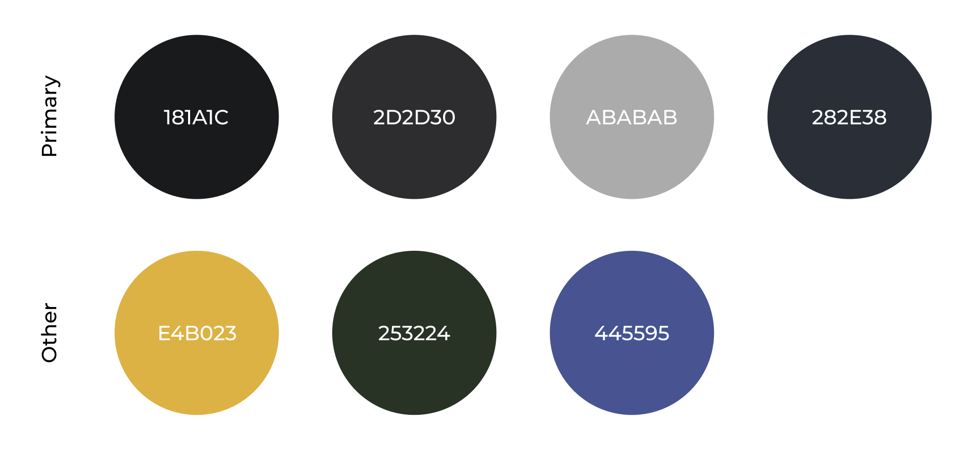
COLOR WORK
After looking at other luxury SUVs on the market, I drew inspiration from the fancy interiors. With those having the more detailed dashboards, I wanted to keep my interface dark and sleek so I wouldn't take away from any design details within the interior.
Another possible issue I wanted to address was keeping the colors low since there are so many screens in the car, this way distractions would be limited and there can be more focus on the road. But, of course I had to add some of the signature EV interface colors such as the yellow.

FINAL DESIGN

This car is meant for people who are looking to switch to an electric car but not give up the features of a classic luxury car. For this reason, I decided to keep the interface dark and sleek while also being conscious of the placement and icons that you would usually find in a car.
To meet these standards, I spent a lot of time designing the screens to be as self-explanatory as possible. When making the switch to an electric car (or even a higher tech car almost fully controlled by screens), relearning all of the controls is something most drivers don’t want to worry about.
Although I went into the designing stages with a plan on how I was going to approach meeting the goals I set, a lot of the important decisions were made during the creation phase. I feel that giving myself this flexibility is important and many of my best ideas are created and finalized during this stage. Below are some examples of key design features I feel either helped me reach my goals or show how I utilized the screen space I was given.

1. Drop-down shifter
The shifter drop-down is always accessible on the lower half of the screen, no matter the page. It is also collapsible so no screen space is wasted when it is not needed and there is more opportunity for other features.
Lastly, the simple straight forward design that mimics classic shifters on other cars and is marked with a traditional shifting icon so there is not much of a learning curve for new users.
PRODUCT SUMMARY
This 5 screen car interface design was created for a Luxury SUV EV.
All controls are reach through the screens making them each very useful, however since the design is well thought out, the actions are intuitive and not overwhelming making this the perfect car for new EV users.
Below, you can find some more examples of some of the features I have included such as the key climate screens, navigation, and more.
2. Smart buttons for temp/fan
These buttons are always accessible under the lower half of the center screen and allow both the driver and passenger to control their own vents. The temperature and fan controls on the outer edges share a button. When the buttons are pressed, they switch between the two, allowing users to adjust by turning side-to-side.
The middle buttons are reserved for auto and sync controls and function as traditional buttons similar to those in most other cars.
3. Passenger navigation screen
By giving the passenger a screen with a navigation app, typing in directions will be easier here rather than leaning over to the middle screen. This also limits distraction for the driver by not allowing them to directly type into the middle screen while the car is in motion. The only place this function is allowed is on the passenger screen.
The driver still has final say in adding directions to the center display.

Navigation (top) Energy (bottom) Temperature (smart buttons) Audio (pass.)

Turning left with indications in dash/HUD, Settings (top) Seats (bottom) Fan speed (smart buttons) Audio (pass.)

Dash/HUD receiving directions from passenger
REFLECTION
After spending weeks on this project, I am very proud of the way it turned out. This was the time in the semester where I really started to feel comfortable with Figma and I think it showed. I would have liked to spend more time on the high-fidelity design, but we did not learn about colors and icons in class and it wasn’t required for the final project. I did my best to learn everything I could, using the resources I had available, and I am happy with the overall outcome.
Working with the company who gave us this assignment was also a great experience. Aside from the instructions, they also met with us a few times and commented on our work at the half way point. At the end of the semester, a handful of us were chosen to present our final designs. Since I was one of them, I wanted to make sure they could see the vision, therefore I learned how to make an interactive presentation within Figma. I think it really helped paint the picture of my design.
Looking back, I would love to try this challenge again to apply not only what I have learned since in school but also what I have learned from real world experience from my time at General Motors. Some of the key design changes I would make would be color, contrast, and some other smaller details.