
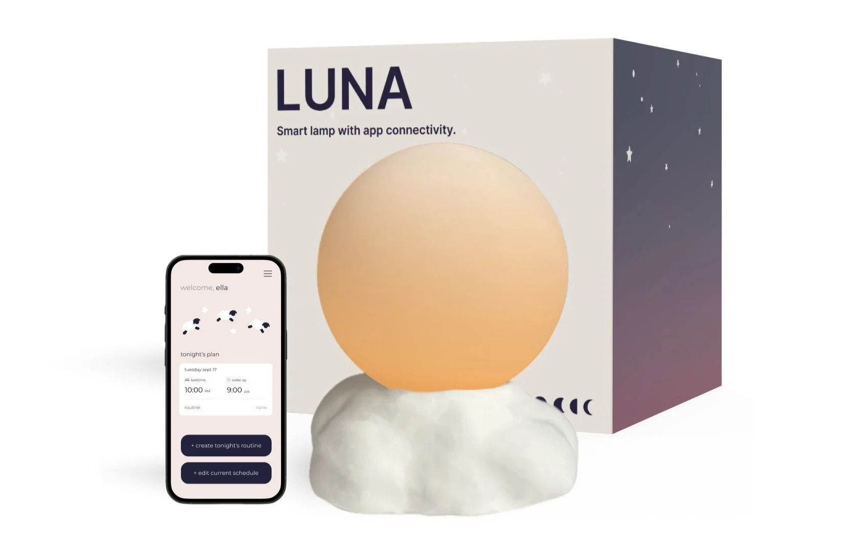
Luna
PRODUCT DESIGN | UX DESIGN | PACKAGE DESIGN
Luna is an app connected lamp that focuses on users well-being. Sleep plays a very important role on peoples lives, and with Luna they can get the most out of their nights. The app allows users to create and set bedtime and routines, then when bedtime comes around and they are going through their tasks, the lamp will slowly change colors with each task from a bright yellow to a darker red as bedtime approaches.
Project Statement:
In order for people to feel their best, they need to feel good about their sleep. The goal of this product is to help users form a consistent bedtime routine that helps them wind down and get ready for bed. By combining the routine aspect with the benefits of circadian lighting, users are left ready for bed in more ways than one.
RESEARCH
After I thought more about what well-being meant to me, I decided to focus on a problem I hold close to my heart… trouble getting to sleep. I know how frustrating it can be and in the past the only thing I have found that helps is a set routine.
I started by doing some research on sleep habits and tricks that help people get a better nights rest. I wanted to combine two ideas into one that focuses on keeping users in a routine as well as using circadian lighting to help lead the way. From there I created some goals.
Bedtime Routine Benefits
Helps brain wind down by reducing stress and promotes relaxation before bed which helps people fall asleep faster and stay asleep throughout the night.
Circadian Lighting Benefits
Mimics the outside light patters which is good for the human internal clock as well as promotes the production of sleep hormones.
From there I created some goals...
Delightful
Giver users a delightfully designed product with elements of engagement, assurance, and cuteness
Calming
Create an interface that is not too bright or engaging around bed time so it doesn’t interfere with winding down for bed.
Subtle
Create a simple lamp design that can fit into any room while also being able to serve its purpose.
USER FLOW

MOOD BOARD

I created this board based off of what well-being feels to me. I drew inspiration from colors, feelings, and scents. By doing this, I was able to get a better idea for how I wanted to product to feel. I mainly looked at the colors and textures for both the app and the lamp.
After I had an idea of how I wanted the app to work, I moved on to sketching out the lamp and screens. Since the goal was to make this delightful, I went back and reviewed some additional research I did on kids lamps and adult lamps to see what people seemed to like and what they didn’t to help me in the beginning stages of sketching.
SKETCHES


After doing about 50 thumbnail sketches, I knew I wanted the light part to be round to mimic the sun and moon but I wasn’t sure which direction I wanted to go with the base. I ended up moving forward with two ideas, the cloud base and the gold “floating” base. One of them I would build with a normal plug in light bulb base, and the other would be battery powered.
After I had an idea of what I wanted the lamp to look like, I moved on to sketching out the app. I started with listing out my key actions it needed to meet the goals intended and then got some ideas down. Similarly to all my other UX work, I always like to start with these types of sketches before moving on to design. This step allows me to map out my actions and make sure I am not getting distracted by its looks too early in the process.
DESIGN EXPLORATION

COLOR WORK

For the colors, I decided to draw inspiration from my mood board. Initially I started with a darker blue background for my app, but then when I started implementing elements of my lamp, I didn’t like how the colors clashed. I knew I wanted the app interface to be soft and nothing too bright, so I decided to go back to the drawing board.
Since the light is going to be glowing shades of yellow, orange, and red (top row of colors), I figured sticking with a soft purple color pallet (bottom row) for the app would contrast well with the graphics and sunset gradients.
FINAL DESIGN

HOW IT WORKS:
This smart lamp app helps users create and follow bedtime routines that promote better sleep, all while setting the perfect mood for winding down. Users can easily plan routines for the night or schedule them in advance, with flexible options to make adjustments at any time. By knowing the user's desired sleep time, the app calculates when to start the routine, sending gentle reminders—one hour before and again five minutes prior—to ensure a smooth transition to bed.
When the routine begins, the app guides users through their planned steps as the lamp gradually dims, shifting from a warm yellow to a calming red to enhance relaxation. After completing their tasks, users can review their estimated sleep time and have a final chance to set an alarm, making it easy to end the day on a peaceful note.
Overall I think the colors ended up working really well together and that the app contains all the actions a person could need to get the perfect nights sleep. Since I wanted to keep this design delightful, I highlighted some key features that meet those requirements and helped me reach my initial goals.
Cuteness
The playful look of both the lamp and app interface gives it a very cute feel despite of its simplicity due to its pastel colors and round edges. I also decided to keep all text in the app lowercase to give it a quieter feel since users will primarily be using the app before bedtime.
Engagement
By having notifications throughout the day with cute sayings or reminders to create tonight's routine, it keeps the users engaged and using the product even if they forget about it.
Reassurance
Before saving and or starting your routine, there will always be a page that gives users a chance to review their routine and make any changes. By doing this, it saves the stress of making sure everything is right the first time and gives some flexibility.

PACKAGING
Then I moved on to the next step which was packaging. I started with steps similar to the beginning stages and started with some research. Since this is a “cute” project, I wanted to add a twist to the packaging which ended up being some sort of surprise element.
MOOD BOARD

I started by creating another mood board for inspiration for the packaging. I decided to draw inspiration from the clouds and sky for the surprise element as well as the sunset for the colors.
This is where I also decided what kind of packaging I wanted to use. Since my product is so large, I was limited to a few viable options. I knew I wanted to do some sort of box but I also didn’t want to have any picture of the actual product on it, so I decided on a match box design with a slide out section with a window to the lamp where there would be a sunset scene complete with cotton clouds.
SKETCHES

After creating a template, I started sketching out ideas in Figma to help me decide on a design and placement. I mentioned before I wanted to go with something simple on the outside to make the slide out box on the inside more surprising. So I kept a muted pink (like the app home screen) for the outside with a blue to pink gradient for the inside box.
This was a very rough sketch and as you will see I ended up adding a bit more depth as I went along further into the ideation stages.
FINAL PACKAGE DESIGN

My final design consisted of the same idea, just taken a step further. After my initial idea, we had a critique where I was able to get some feedback. My main areas for improvement were color and design. So, I went back and made some changes such as font color, simplification of shell design, as well as some more details on the slide out window area. I also decided to add some starts to make it more “dreamy”.
Above is a 3d rendering of what the new design would look like. However, what is missing is that in the window area, there would be the lamp sitting on a layer of cloud like cotton balls as well as the same gradient from the outside. The idea was that the element of surprise would be the night time scene that buyers would pull out of the simple, more generic box. I hope to one day come back to this and create a real model of this design with the cotton balls and all to really bring my idea to life.

PRODUCT SUMMARY
Luna is an app designed to help users get better sleep. By combining the benefits of a daily bedtime routine and circadian lighting, Luna will leave all users ready for bed.
The app allows you to set bedtimes, created schedules, and set alarms either right before bed or in advance.
How it works:
Set your bedtime and create your routine.
Start your routine when the app tells you (times will vary depending on sleep goals and amount of tasks).
Complete your tasks one by one and as you move through the different stages, your lamp will slowly do the same going from a bright, soft white all the way to a dark, dim red.
Finish your routine and sleep well!
REFLECTION
After spending a couple weeks on this project, I found that I really enjoyed blending the digital aspects with the physical. I found it really interesting researching and finding ways to get them to work hand in hand while also achieving my goals. The part I found most fun was building the actual lamp. It has been a while since I have had some non-computer focused work and it was a nice break. I did however have some trouble with shaping the base and wiring the lamp base, but after some trial and error, I am proud to say I made it work.
I am very happy with the way this product turned out and the amount of time and effort I put into this piece. Because of this, I plan on coming back and taking it a step further and working on adding some animations and some more fun design elements to the app. But like most designers, I have a million other things to focus on right now, but the next time I have extra time, this will be the first thing on my list.